Feelings From Color
- Nov 27, 2015
- 2 min read
Different colors are used in art and design to bring a different emotion.
Artist and designers try to evoke a feeling or emotion when you see their work. One of the best ways to do this is to use the appropriate color.

The Walmart logo may look like a simple thing, but a lot of thought went into the design and the color.

To explain, first let us take a look at the color chart below and see what color represents for each emotion.
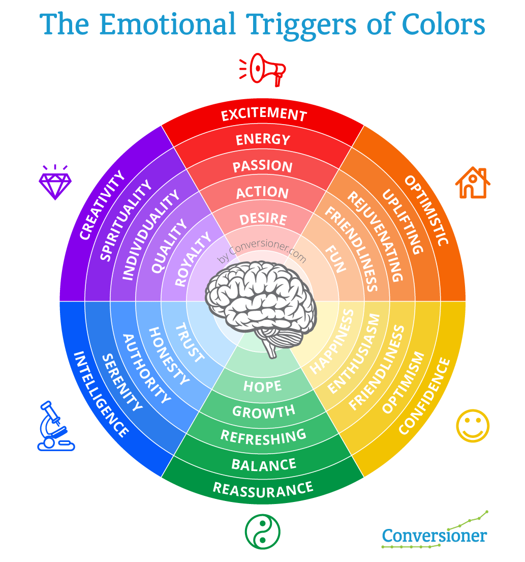
Now looking at Walmart’s logo, we understand that it is more than just a logo, but a logo that represents a store that is honest (blue) and friendly (yellow).
This trick of using color to represent emotion from a companies logo is used time and time again.

Citybank uses blue as well, which we now know provokes a feeling of trust. Red means power, passion, or action. It is also worth mentioning that the letter “t” and the red arch represent an umbrella. This design with the use of color gives us the impression of a company that we can trust and is secure through a powerful (red) umbrella.
Under purple in our color wheel, one of our feelings is spiritual.
Coincidentally searching for spiritual logos, you will find many of them using the color purple such as this one from Spiritual Healing Studio.

Green, in our color wheel represents growth, hope and balance. This logo even has two of the descriptive words within it along with the matching color.

Provoking feeling with color is not only limited to logos and advertisement, but also is very useful in art.

When I look at this painting I get a feeling of peace and happiness. I don’t need our color wheel to confirm my feelings, however for the purpose of this blog, when we look at the chart, my feelings match up with it.
How about panting something passionate and exciting (red).
As shown in our color wheel, red can represent passion and this painting seems to represent that exact feeling.

Lets look at what happens when we change the color.

We no longer get a feeling of passion from this, but rather some sort of weird sickening feeling. The image just doesn’t go with the color.
What does something uplifting and happy look like in a painting?

If our color wheel is correct, then this painting should give us a happy and uplifting feeling. For me, that is exactly what this painting does.
If you’re looking to create a spiritual painting, then purple is the way to go.

Color is very important within art and design. Like it or not, color brings out certain feelings. So before you begin you next piece, ask yourself what do I want people to feel when looking at this?


Comments